Our Application Builder gives you a number of customization options to personalize your application. In this article, we’ll review the three different tabs and the components that comprise the Application Builder. If you’d like to see a video version of this article first, please click here.
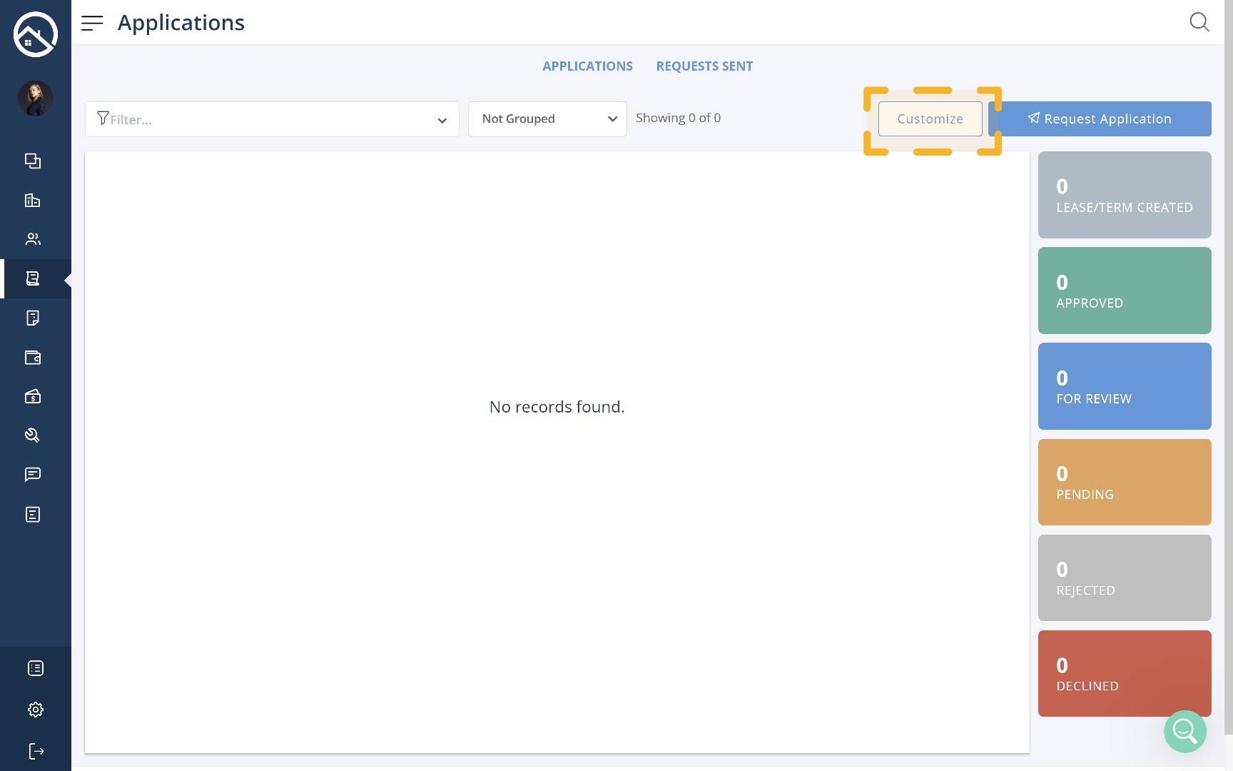
First, you’ll want to access the Application Builder by going to your Applications page on a web browser (you will not be able to customize your application from the mobile app). From here, you’ll either click the “Customize” button, or you’ll go to the Templates tab and click “Edit” if you’ve enabled multiple applications from your Screening settings.
Application Settings Tab
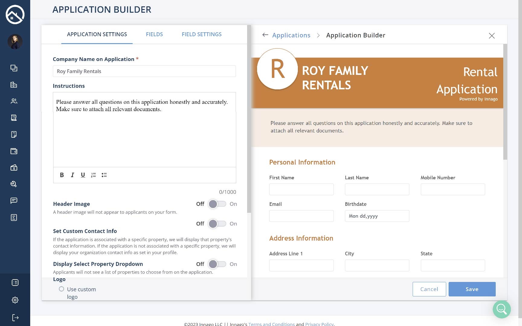
On this tab you’ll choose your Template Name (if you’ve enabled multiple templates), provide your Company Name, add Instructions, change your Header Image and more.
Set Custom Contact Info
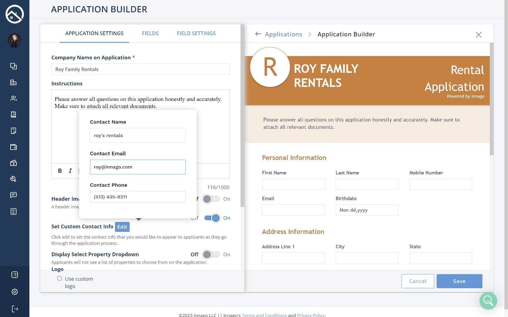
If the application is associated with a specific property, we will display that property’s contact information. For more information on setting contact information specific to each property, please click here. If the application is not associated with a specific property, we will display your organization contact info as set in your profile. You can also Set Custom Contact Info by toggling the option on and providing those details.
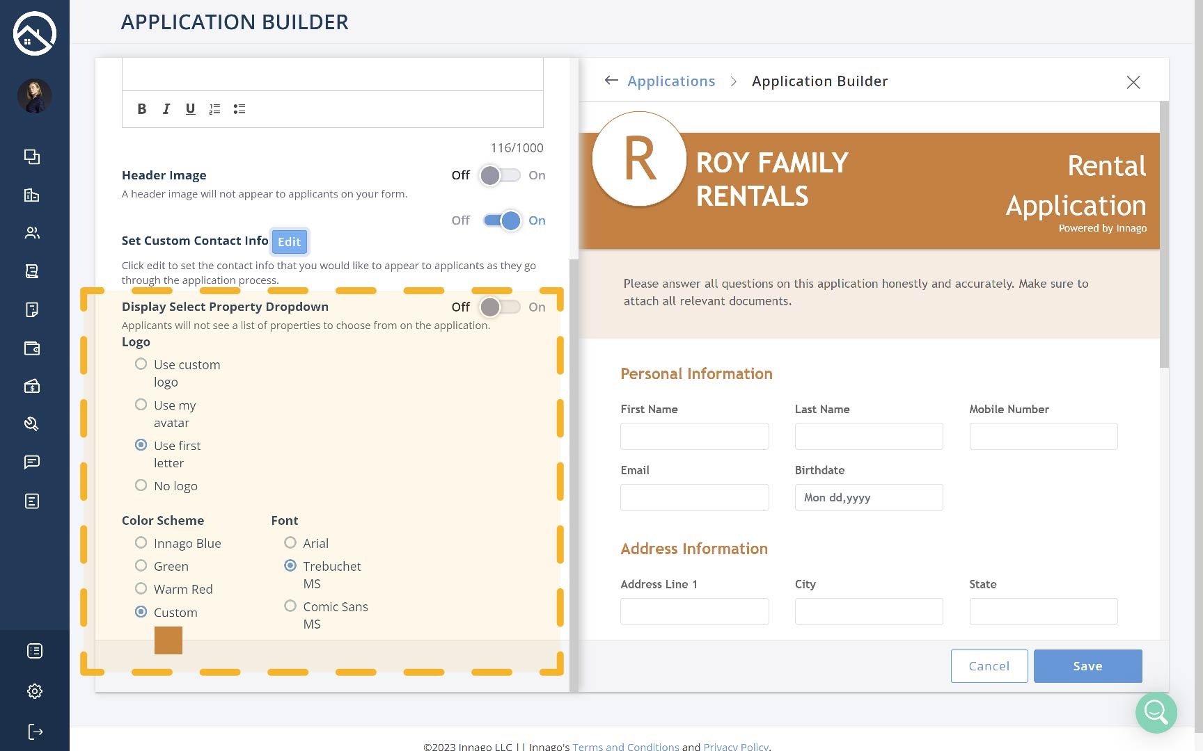
Display Select Property Dropdown
If enabled, applicants will see a list of properties to choose from on their application.
Visual Theme
The very last section of this page will allow you to choose a Logo, Color Scheme, and Font to give your application your own custom feeling. You can change your default image at any time by clicking Change Default Image.
Fields Tab
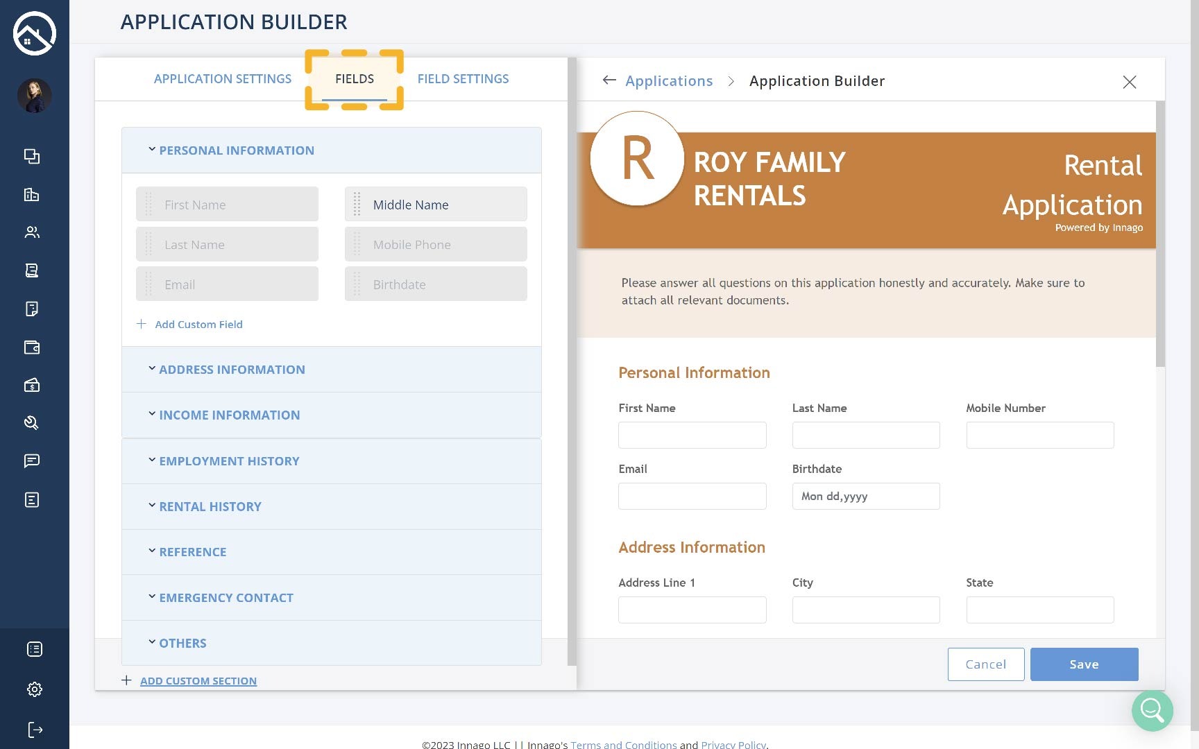
On the Fields tab, you’ll be able to review all of the fields currently included on the application. You can display or hide certain fields by clicking on them.
If a field is highlighted, it is currently not included on the application, and is available to be selected. If a field is grayed out, that means it is currently selected, and is already actively displaying on the application. You’ll see a live sample of the active fields on the application preview located on the right side of the screen.
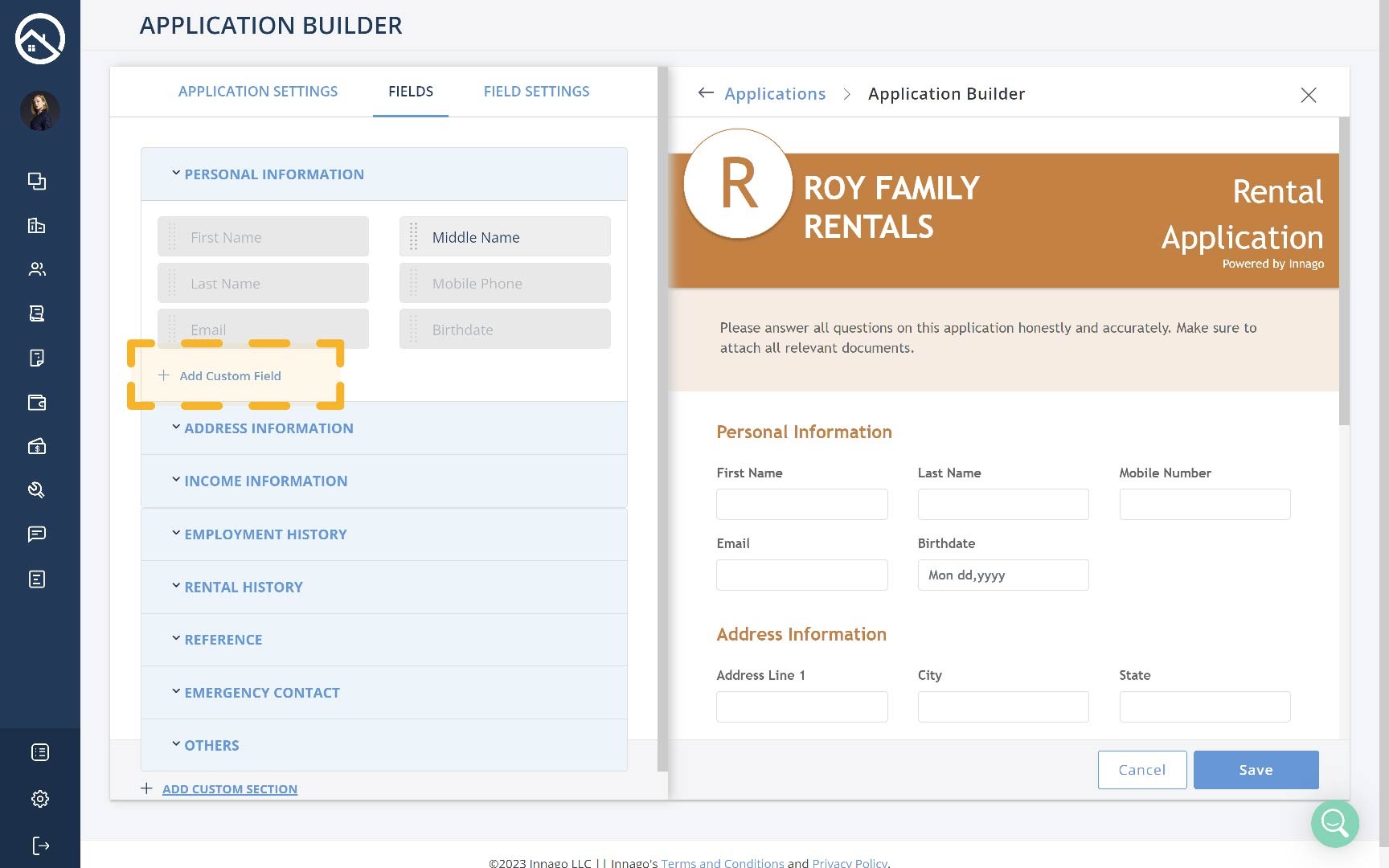
Add Custom Field
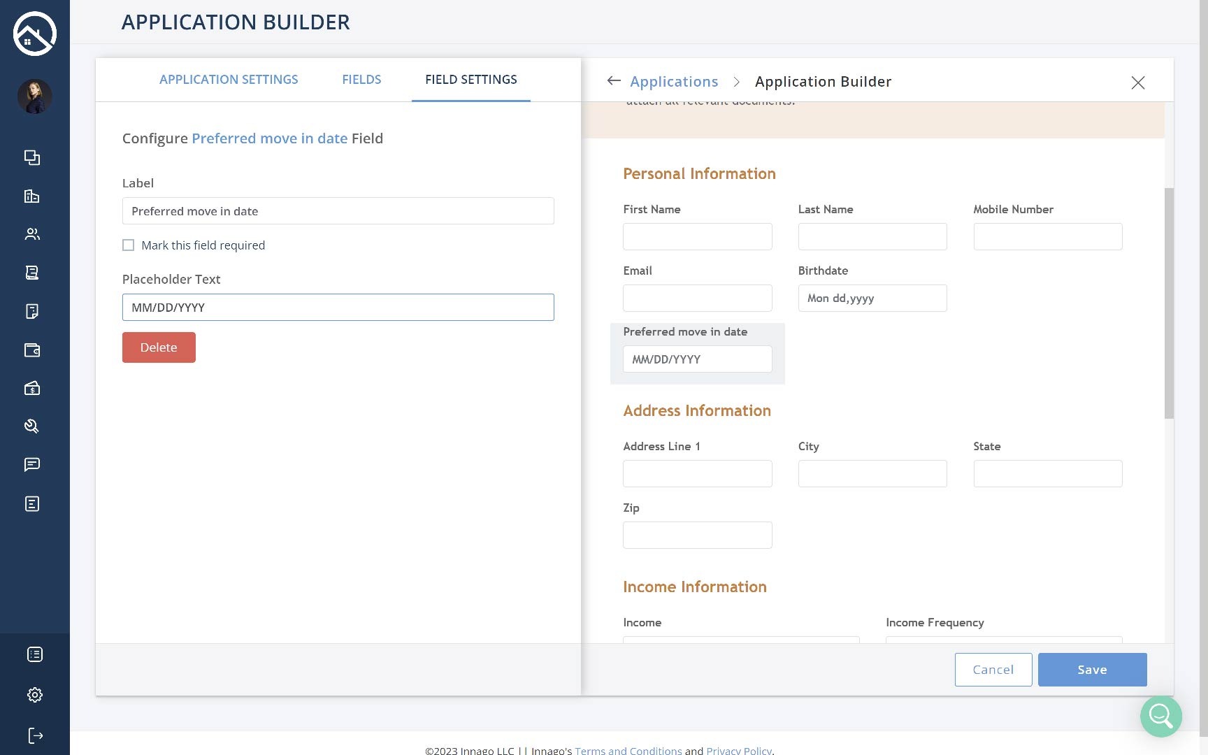
Once you’ve clicked this button, you’ll be taken to the Field Settings screen where you can enter the details of your Custom Field. You’ll choose whether or not you want the field to be a Text Box or a File Uploader, enter in the Label name, and choose whether or not you’d like to mark the field as required.
If you’ve selected a Text Box as the Control Type, you’ll also be able to enter in Placeholder Text as an example for your applicant of how you’d like them to complete the field.
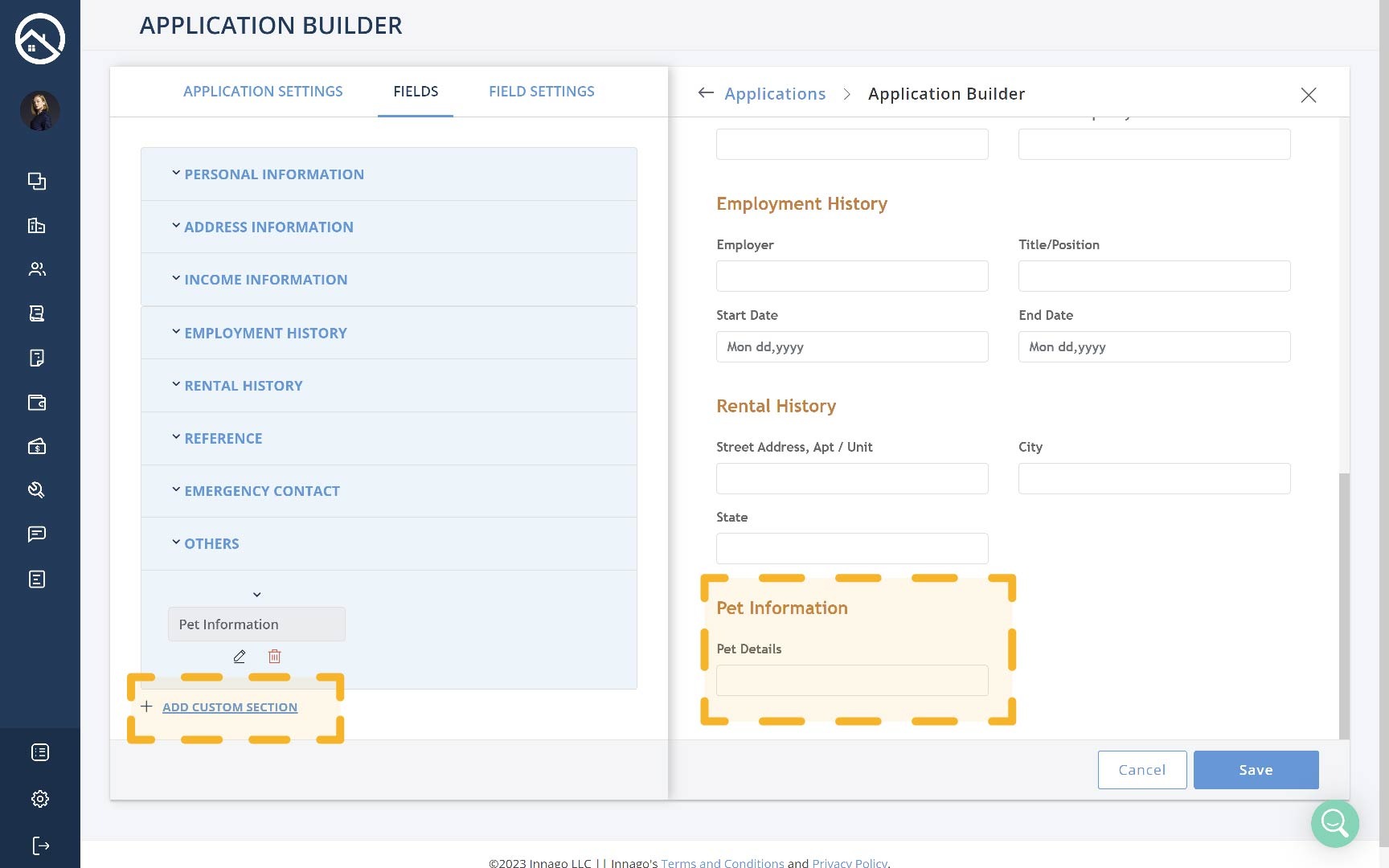
Add Custom Section
Once you’ve clicked this button, you’ll be prompted to enter in the name for the Custom Section. After entering in that information, you’ll click the down arrow above the section name to display its fields. You’ll be able to click Add Custom Field to add the first field under your Custom Section.
Field Settings Tab
The Field Settings tab will allow you to edit pre-existing fields. All you’ll need to do is click the field from the preview screen on the right, and then you’ll be able to make edits to that chosen field.
From this screen you change the Control Type, Label, and Placeholder Text.
Finally, make sure to click ‘Save‘ in the button right corner when you’ve made all of the necessary additions/changes.
That’s it! You’re all set. For information on how to send out your application to potential tenants, click here.

